Quick Summary: I’m not sure about you but I find creating a brand guide a little annoying. It’s one of those design tasks that I’m rarely excited about because it’s not super creative and tedious to make. However, brand guidelines are a really important document to have and in this post, I’m going to share some reasons why it’s important and some quick tips for creating one.
The difference between a brand guide and a style guide
In this post, I’ll be using “brand guide” and “style guide” fairly simultaneously but they are different documents. A brand guide (or brand book) focuses on the purpose or core idea of your organization. It’s geared more toward meaning and inspiration, while a style guide is geared toward maintaining visual brand consistency. (Source) This post is focusing on the importance of creating a style guide in order to ensure your brand is visually consistent across all platforms.
Why have a style guide?
I’m not sure about you, but style guides can be annoying to create. You’ve already created a beautiful logo or have been working with a brand and now you have to stop your creative design work to create a document with information you already know as the designer. That’s the view I used to have, but a style guide is an essential document for both you as the designer and your clients for quite a few reasons.
- Keeps everyone on the same page. Have you ever had the horrific experience as a designer when someone creates an ad or graphic that doesn’t fit your brand’s aesthetic? A style guide keeps this from happening because as much as we’d love to design every single thing for a brand we’ve created- it is just not possible.
- Helps you advocate for yourself and your work when you have imposter syndrome. If you’re anything like me, it can be difficult to feel like an expert in your field when you’re the lone designer who also happens to be the youngest on the team. When you create a style guide it serves as your advocate, so if anyone questions you or your work, you can refer them to your guide.
- Keeps you as the designer on track and helps streamlines your process. I understand part of the fun of being a designer is experimenting and coming up with fresh designs, but when you have deadlines and are working on multiple projects that are similar in scope for the same brand, it’s really nice to have a baseline so you’re not reinventing the wheel every single time, which means you can work faster and more efficiently.
Considerations for establishing your brand guidelines:
Now you have some reasons why you should have a style guide- now let’s talk about what to include in it.
- Include the basics. Proper use of the logo, logo variations, color scheme, and typography should all be included in your brand guidelines.
- Keep it simple. A brand guide’s purpose is to relay information so don’t get too caught up in making it look incredible (unless you really want to). Let your brand do the talking.
- Know your audience. Who is the main audience of your style guide? Photographers? Other designers? Copywriters? Knowing your audience helps you to tailor the language of your guide so it’s relevant to who’s reading it.
- Include “eye candy” to move your viewer throughout the document. Brand guidelines can be very dry so include some nice visuals to keep your viewer’s interest.
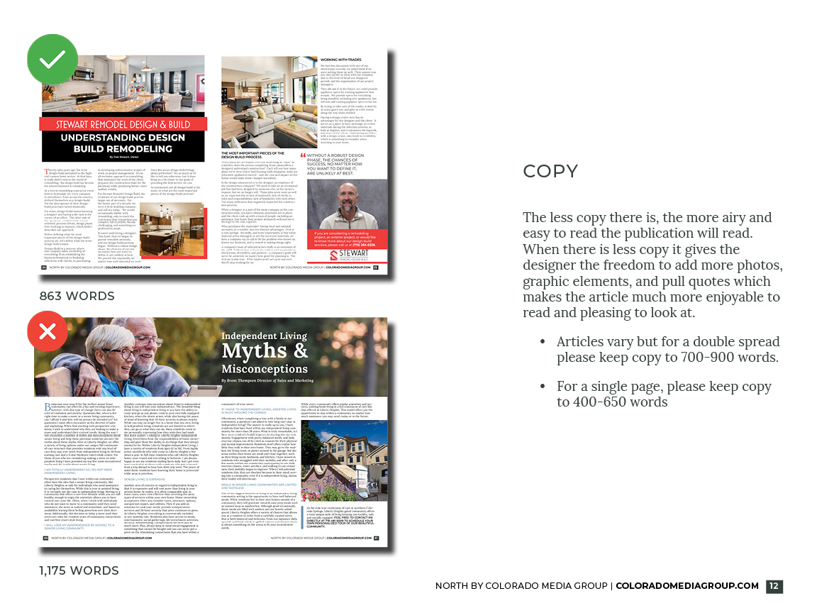
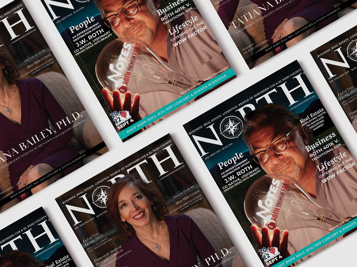
Some “eye candy” I included in my most recent style guide for NORTH magazine - Know what’s important to you/ your personal design gripes. We have a lot of design-specific complaints when we’re working with brands and clients (too much copy, low-resolution photos, not enough photos, etc.) rather than suffer in silence, in instances where you have some say and control, specify your asset requirements in your style guide. Include guidelines for things like photography and copy which not only helps you but it keeps the brand visually consistent.

So there you have it! A few tips for creating your style guide and the importance of doing so. To help get you started in creating your own style guide, here’s a free template for InDesign.
Do you have any tips for creating a style guide?
Until next time,


